Reviving Antwerp’s long lost beer: visual identity, illustration and packaging range
Client: Antwerpse Brouw Compagnie
History of Seefbier
SEEFBIER is a historic specialty beer from Antwerp, created in 1814 and brewed until the 1930s. It was the most popular beer in the region for over a century, giving its name to the Antwerp district “Seefhoek”. As the local craft brewers disappeared due to the First World War, so did Seefbier. Legendary and renowned, the recipe was presumed lost for many decades. 80 years later, the authentic recipe was recovered and the beer style revived by Antwerpse Brouw Compagnie. Since its relaunch, Seef has become one of the most awarded beers in Belgium, winning gold medals on the most prestigious international beer competitions.
Visual Identity
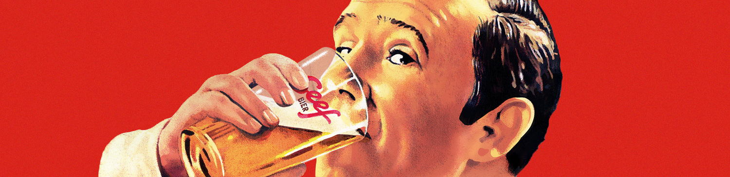
For the relaunch of Seef, Antwerpse Brouw Compagnie was looking for a visual identity that reflected the commercial art of the 1930s-1950s, the period when Seef ceased to exist. During the first half of the 20th century the hand-letterer’s craft has been indispensable to the advertising and design trades, so we chose for a hand-lettered logo design. A refreshing rework of an old illustration became the brand mascotte.
Packaging and advertising
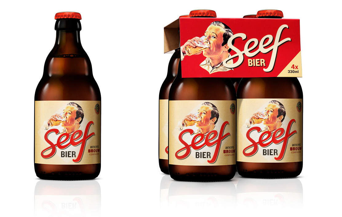
A range of labels and packaging for international markets, advertising, branded glasses and displays were created. The Seefbier enamel sign – commonly used for advertising in the early 1900s – became a sought-after POS item.
Some images (c) Antwerpse Brouw Compagnie